Reflection
Planting the seeds for the world's first PXM platform
I had the privilege of being the first designer and sixth overall employee at the unicorn tech startup, Salsify.
I got to be the first to wade into many of our formative experiences - from a guided free trial to our first dashboard to our initial foray into data science - and learned how to lovingly grow an enterprise SaaS product from scratch.
Here are some highlights from the start of my career.
Enhanced Free Trial
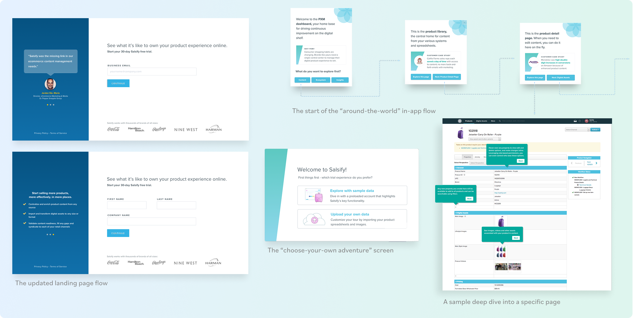
Our free trial had long been a lagging source of new leads. As the designer for our the growth team, I got to completely reimagine the experience and push a new in-app guidance tool to its limits.
The simplified landing page was built for easier data capture and establishing trust through clean design and social proof. The streamlined trial provisioning flow halved the little wait time remaining in an early onboarding.
The new flow also challenged the hypothesis that trial users would only see value if they explored Salsify with their own data. It introduced an option to explore with sample data in a preloaded account, which featured an in-app educational flow powered by Appcues that incorporated customer case studies and success metrics.
Sales-Ready Dashboard
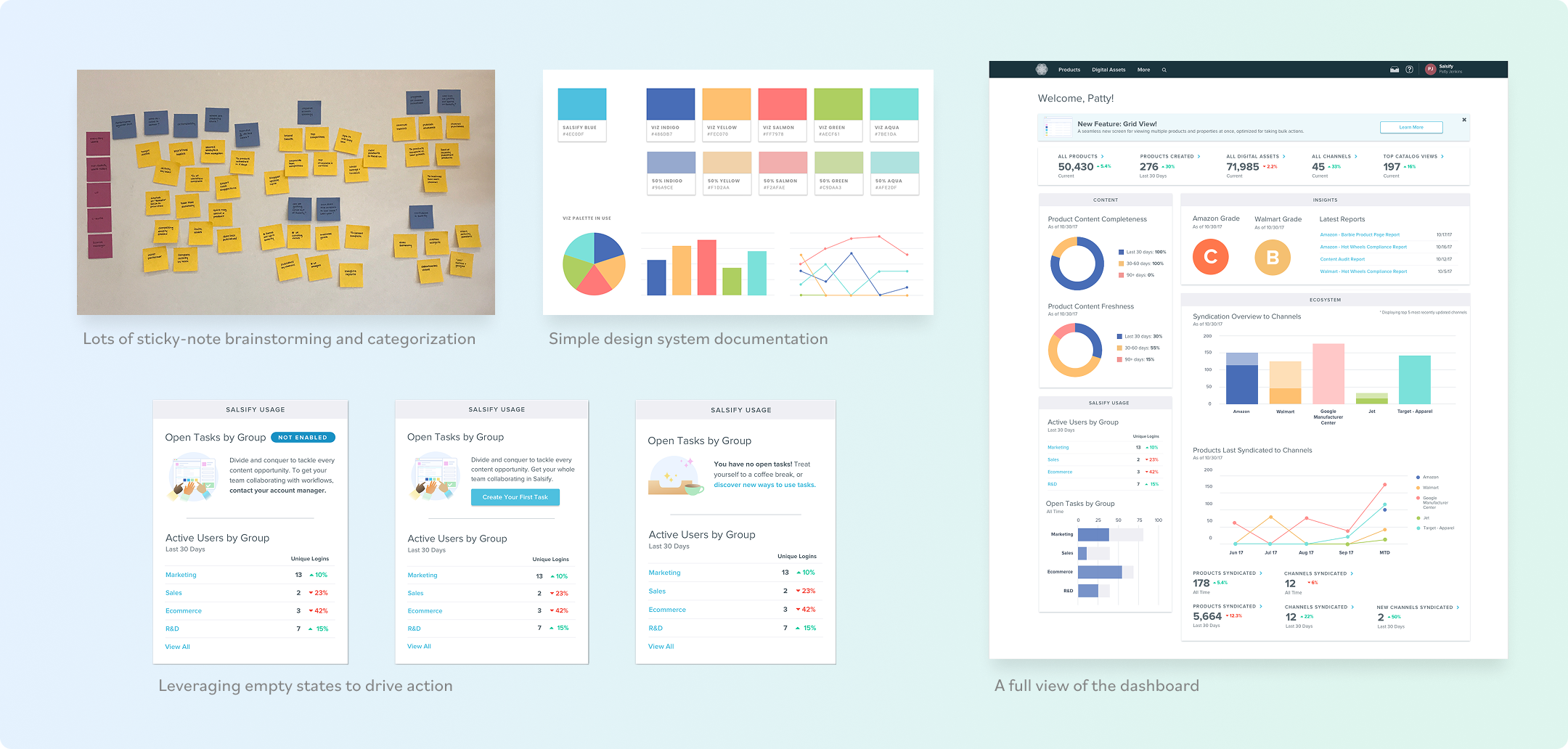
For years, Salsify users logged in and were dropped directly into a list view of data. My team was tasked with the first cut at reporting in Salsify, optimized for driving action and supplying key insights for ecommerce managers.
What resulted was a visual representation of Salsify's guiding framework, PXM or "Product Experience Management." Widgets representing the three pillars of PXM - content, ecosystem and insights - contained charts nudging users toward key activities to round out their ecommerce strategy. Bright colors purposely kept the data agnostic to accommodate a variety of companies and their goals. Empty states were leveraged to softly encourage users to "unlock" more of the platform.
Actionable Insights
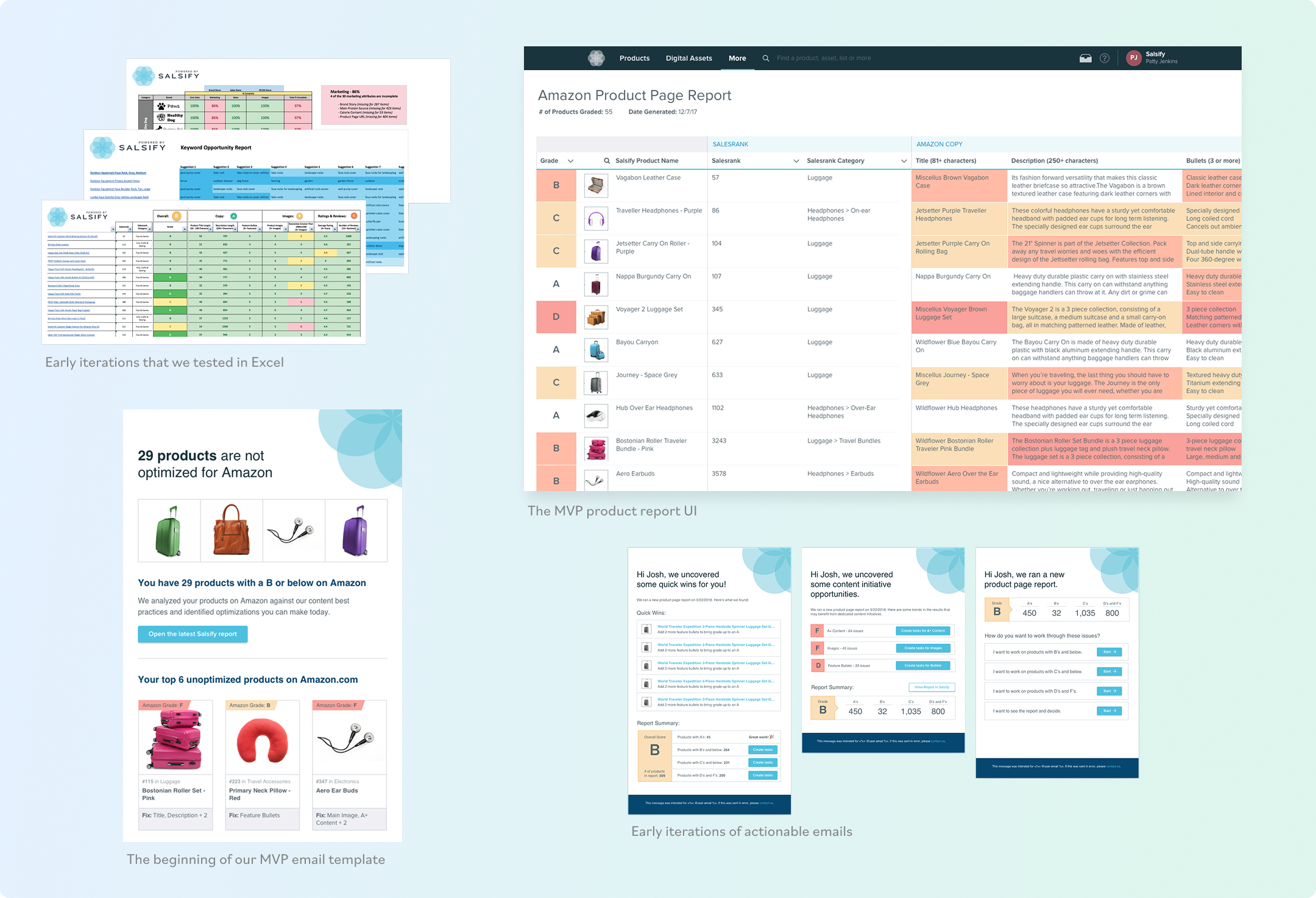
Providing in-app analytics had been a critical part of the Salsify vision from the beginning. I had the privilege of designing the go-to-market MVP for this long-awaited feature and providing a much-needed refresh of UI patterns in the process.
We delivered a new report UI, heat-mapped with color and tested for accessibility to help users identify their areas of improvement across their product collection. To ensure a cohesive experience, I also designed a report configuration tool, email inbox, and email notifications optimized for action.