Reflection
Bringing the design toolkit to over a dozen CRM solutions
I brought user research, design thinking workshops and the magic of Figma to some of the most recognizable companies in health care, wealth management, video games and more as a consultant - and second designer! - with Silverline CRM.
I designed custom React solutions in Salesforce, which allowed me to stay in the realm of traditional product development while also learning to work within an extremely robust design system.
To protect the identities of my former clients, I've highly abstracted the screens and lessons learned within this reflection.
Lots, and lots, of alignment artifacts
Producing an alignment artifact like a user task flow, experience map or wireframe is a non-negotiable in my surface to core approach to design. I've seen how teams become overwhelmed in the nitty-gritty details of implementation if we can't comfortably answer: "How would you explain this process to a fifth grader?"
Depending on the project needs, I'd facilitate formal process mapping programs over several weeks or napkin-sketch artifacts over several days.
Example
Mapping a medical workflow involving 7 key personas
This company facilitated pre-employment medical exams that cleared thousands of people around the country for work. We needed to orchestrate and streamline a workflow where 7 key personas "passed the baton" back-and-forth over the course of several days - from scheduling to facilitating to evaluating to billing - and ensure that our solution was air-tight.
I developed what we internally dubbed "the swimlane storyboard" over several in-person work-shadowing sessions to ensure we were aligned on all of these handoffs. This provided invaluable support for one of our biggest implementations.

Example
Prioritizing with pain in a patient intake process
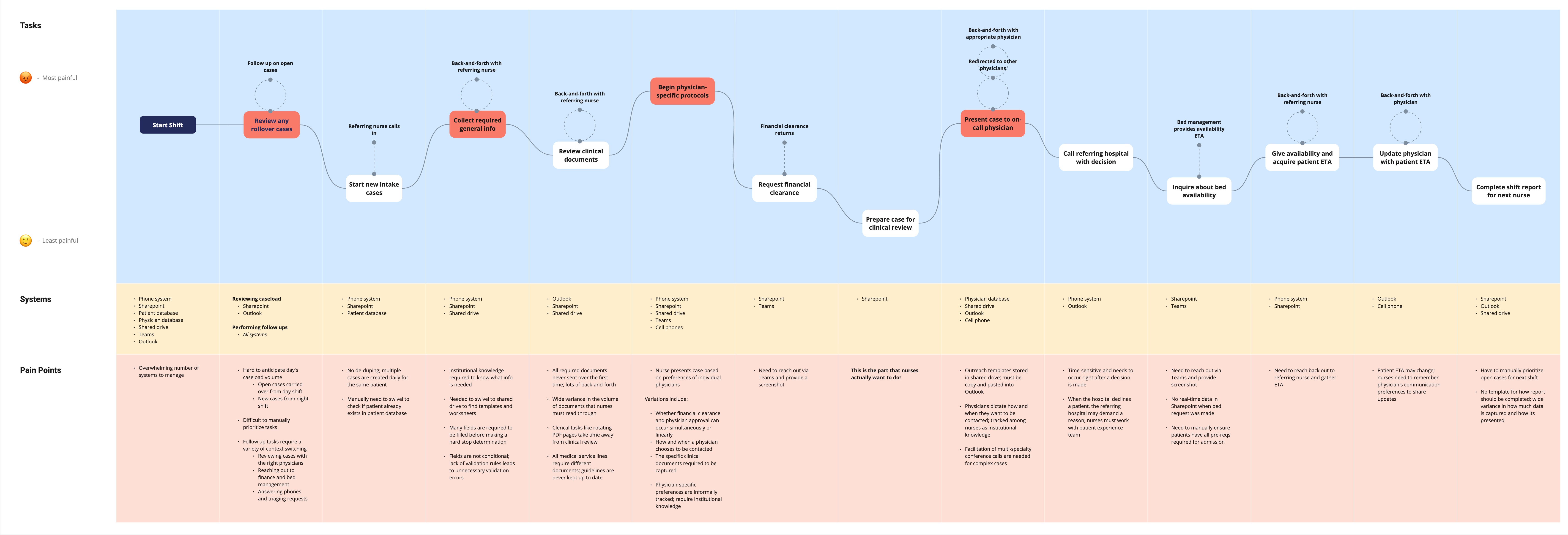
I gained so much empathy for the overworked nurses that we were supporting as part of this project. We were tasked with streamlining their patient intake process and, while we had a solid idea of the art of the possible, our team needed to figure out what to prioritize first.
I proposed an experience mapping exercise, and after just a few interviews, was able to simply but effectively map their workflow against their pain. Not only did this help us prioritize, but our presentation elicited tears from the nurses who were so grateful to feel heard.
Custom, Enterprise Solutions in a Common UI
Designing Salesforce solutions might sound niche, but it's just like building within any other SaaS platform. You have to consider the system you're building within - the data model, the design system, the technical frameworks - and make informed decisions about when to live within that system and when to break it.
I worked on over a dozen end-to-end experiences in custom React apps embedded both within or separate from a client's Salesforce instance.
Example
Making complexity invisible in a loan proposal flow
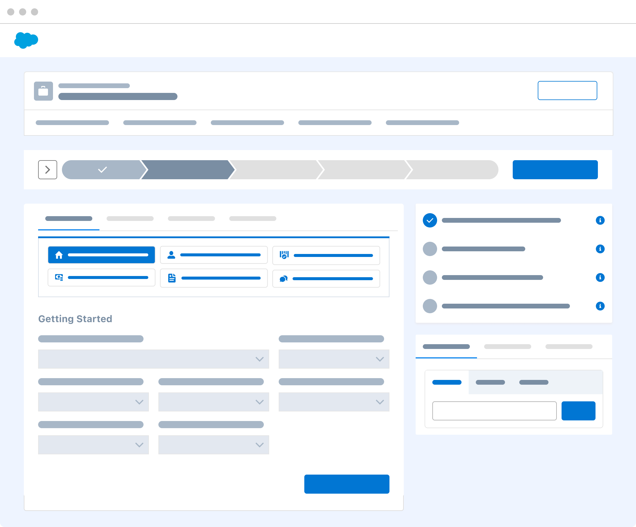
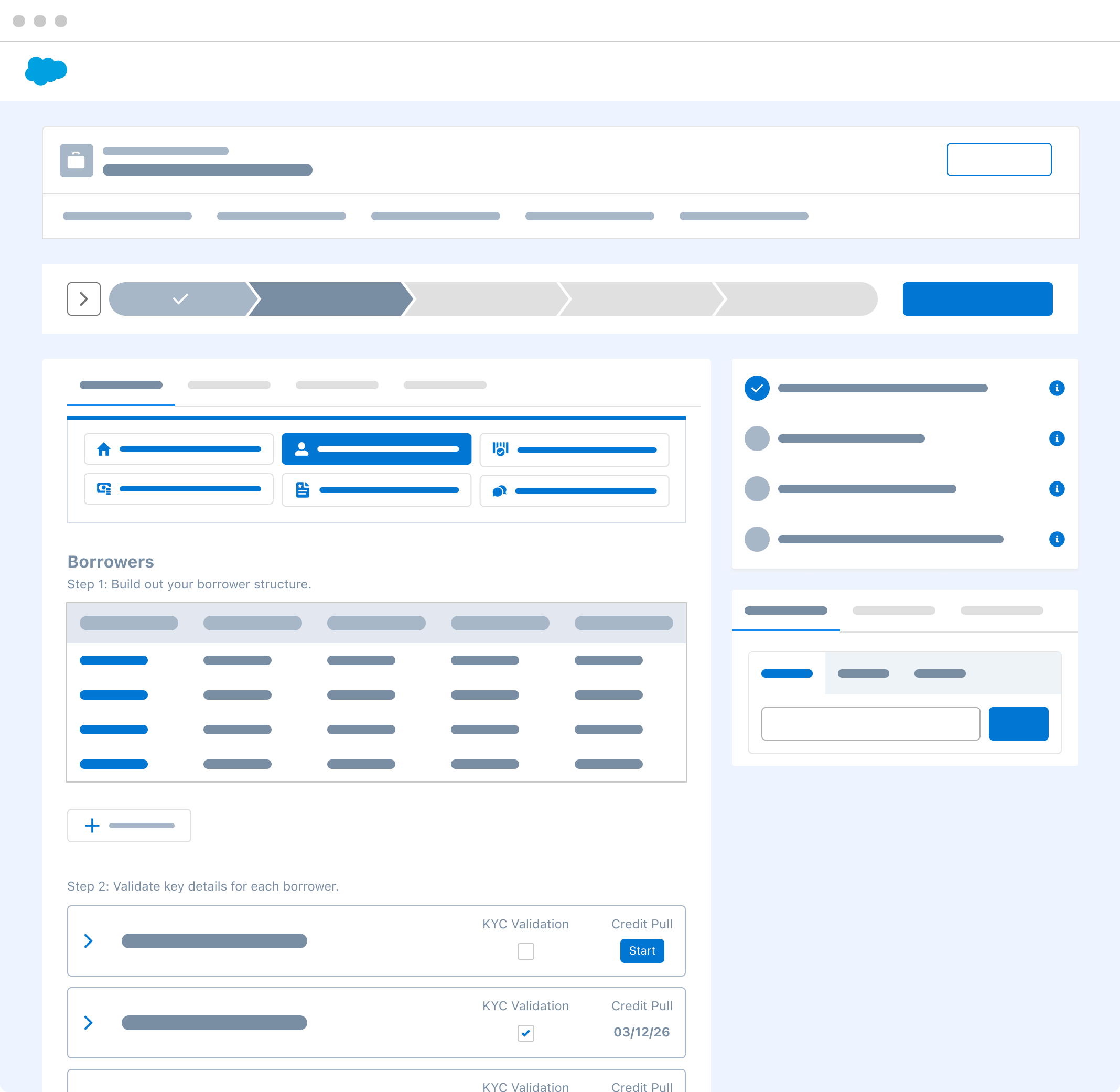
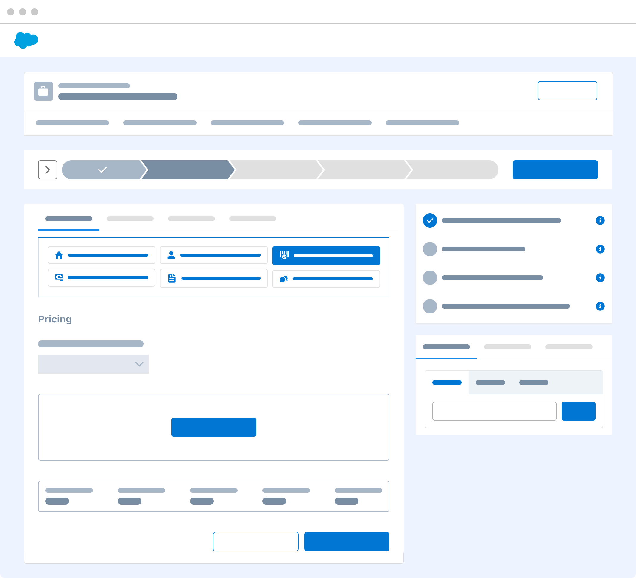
The level of detail required to successfully design a solution for personal loan proposals made me feel like I was taking a college course. Balancing regulatory requirements, endless conditional logic, third-party system integrations and trying to make that orchestration invisible to the end user was no small task.
More than on any other project, I collaborated directly with our finance SMEs to ensure that my designs satisfied industry requirements and I was simplifying the experience in all the right places.
Example
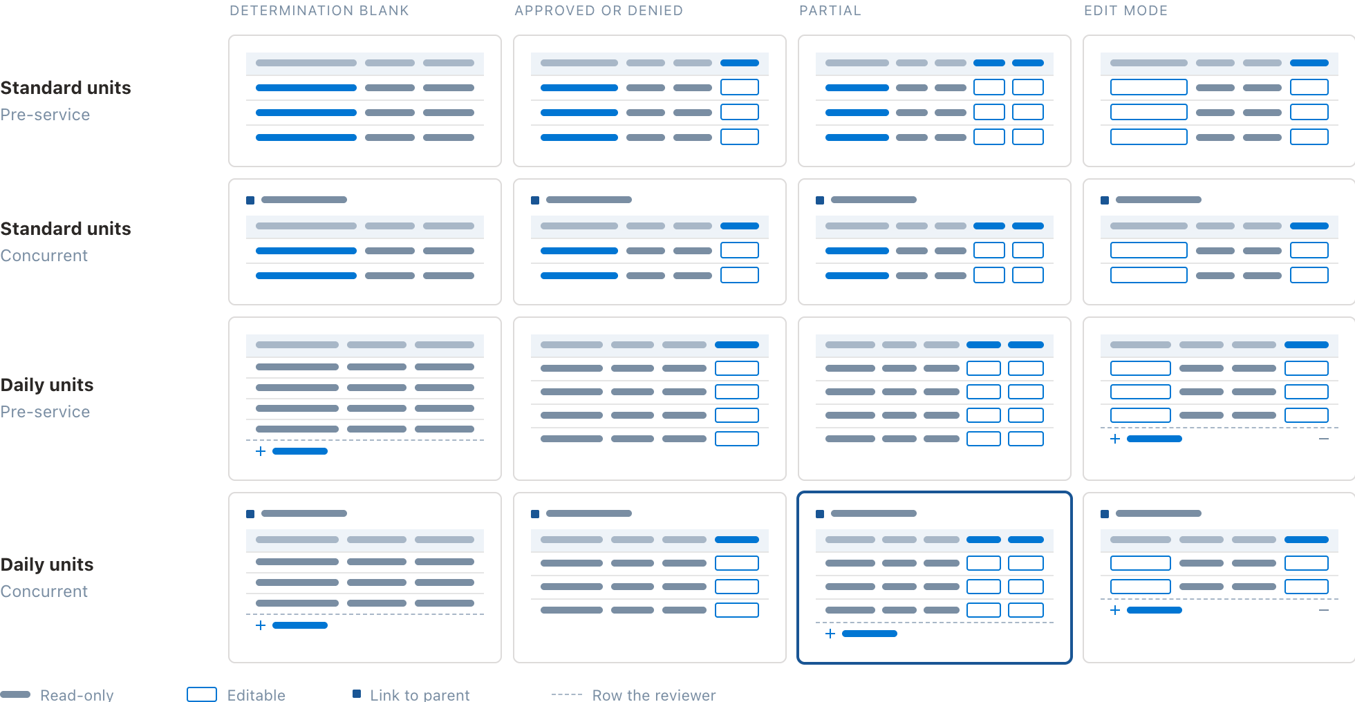
Displaying dynamic info for a utilization management UI
Our client had created a homegrown utilization management tool that took "above the fold" literally. They fit over 30 fields on one 1366x768 screen with the rationale that reducing scroll and click-throughs made for a great experience. In reality, users could barely navigate the interface, nor easily find the information that was most important to understand at a glance when approving additional insurance coverage.
In order to radically simplify the UI, I needed to dive deep into all of the permutations of an insurance claim to create dynamic components that could scale to reflect different states.
User Research, Shared with Change Management
I had the privilege of conducting user research engagements in partnership with our change management team. Their perspective forever changed for the better how I think about scoping projects for maximum impact and user value.
Design for the announcement, not just the feature
Change management taught me a new test when it comes to scoping an MVP: "What subject line will cut through a cluttered inbox when we launch?" As long as we can build a feature that actually backs it up, bolder claims like "Automatic," "One click" and "Never again" hit much stronger to an end user than "streamlining" or "reducing." It's become a quick gut-check for whether an MVP delivers enough value to be worth announcing
Pain points aren't the whole story
I used to rely on pain points alone to decide where to focus. Change management added a second lens: readiness for change — how willing and able users are to adopt something new. Prioritizing means weighing both. Sometimes we can take a bold swing at a pain point out of the gate; other times we need to plant seeds and bring users on the journey.
Gut-checking decisions with training docs
When we're making technical tradeoffs during development, I like to pressure-test decisions by writing a quick mock training doc of an experience. It's one thing to understand a feature as an internal team; it's another to explain how to use it to someone who wasn't in the room.